BRIEF
Create a next-generation tech brand to disrupt the warehouse automation industry.
SOLUTION
We created the ‘Space Reimagined’ concept, which augments Pio’s purpose by flexing the brand around the idea of utilising space more efficiently and effectively while expressing the behaviours and benefits of the product. The outcome is a monospaced, adaptive and modern brand that shows a new way to reimagine space.
We defined a new brand strategy, identity and visual language and product design.
MY ROLE
Lead Design & Art Direction at RGA.
After the success of Rise 1.0 / House of Mamba I was asked to work on the Nike RISE 2.0 and push it to the next level. We delivered the world’s most advanced basketball coaching tool. A connected ecosystem of LED court, pinpoint accurate tracking and intuitive coaching app. It allows coaches to automatically assess, monitor and track players on court, building an accurate performance profile of up to 30 players simultaneously. Coaches can then bespoke create drills based on players’ strengths and weaknesses, demonstrate and annotate plays directly beneath players’ feet and deliver instant on-court feedback. Elite or amateur, it helps coaches improve the game of any player at any level.
MY ROLE
Art Direction + Lead Design.
BRIEF
Create a next-generation tech brand to disrupt the warehouse automation industry.
SOLUTION
We created the ‘Space Reimagined’ concept, which augments Pio’s purpose by flexing the brand around the idea of utilising space more efficiently and effectively while expressing the behaviours and benefits of the product. The outcome is a monospaced, adaptive and modern brand that shows a new way to reimagine space.
We defined a new brand strategy, identity and visual language and product design.
MY ROLE
Lead Design & Art Direction at RGA.
BRIEF
Design the new EE Brand System to establish itself as the UK's foremost customer-centric technology brand driven by innovation.
SOLUTION
We took the brand back to its core component, The Smart Dot, and gave it a new, simpler aesthetic and defined new behaviours to allow the brand as much playful, multi-channel utility as possible.
MY ROLE
Design Lead at Zag.
BRIEF
How to make the latest pair of Adidas football boots desirable for aspiring young footballers?
SOLUTION
By disrupting the way everyone hears about it. GLITCH was sold with no ads, no media spend, no social and no big player. The buzz came from word of mouth, as buyers accessed the product via an exclusive, invite-only, app that was built to sell it. The aim was to create a true mobile commerce experience where the delivery was done within 4 hours and the boots were literally handed to the customer. GLITCH boots flying off the shelves despite not being advertised anywhere.
MY ROLE
Creative Director, Designer & Illustrator.
BRIEF
How to showcase Publicis Sapient as an innovation leader in the development and delivery of digital business transformation at the Money20/20 Conference.
SOLUTION
By designing a live-data digital installation that would bring to life a radical new data-driven future for consumers and business. The idea was to show that data can be organised and used to create innovative, personalised new services.
MY ROLE
Design Director.
BRIEF
Vodafone Global Visual System.
INSIGHT
The way in which customers interact with brands has changed dramatically. Today, digital communications are the most common touchpoint between brands and their current and potential customers, particularly in the technology sector. For Vodafone, with over 500 million customers worldwide, a new digital-first brand identity was needed to help reinvigorate their communications and bring messaging to life.
SOLUTION
A digital brand identity for a digital business. We created the Vodafone dynamic system and ownable series of visual elements combined to form a new brand identity created with motion at its core, ready for life on screen.
MY ROLE
Design Director at Superunion.
Nike Football World Cup global art direction, visual center and design system. Created to be used globally on events, retail, product and advertising during and after the 2014 Football World Cup. Football obsessed teens were given a place to “Risk Everything” and showcase their phenomenal football. The world’s biggest "Winner Stays" football tournament was undertaken across 28 cities globally. To showcase innovation and lifestyle, 8 hubs called the “Phenom Houses” were set up in Berlin, Buenos Aires, London, Los Angeles, New York, Paris, Rio de Janeiro and Tokyo.
MY ROLE
Art direction, design and illustration. Developed at AKQA London and Nike headquarters in Portland.
Featured On:
Hypebeast
Soccer Bible
Complex Magazine
Sneaker Freaker
SlamXHype
The Nike Football app allows players to create matches, banter with friends and teammates, and be the first to access exclusive Nike product.
The first football language was created (for the app), and later extended to social media, namely Facebook where it is available as Nike Football stickers’ pack.
MY ROLE
Art direction, design and illustration.
Developed at AKQA London and Nike Portland.
We transformed the historic ‘Shanghai Jiangwan Basketball Stadium’ into a futuristic basketball mecca – House of Mamba. The first full sized LED reactive basketball court that was part of Nike Rise campaign in China to push kids to new heights. The LED court taught aspiring players the fundamentals of Kobe Bryant’s Mamba Mentality.
The court utilized motion tracking and reactive LED visualization to train, guide and challenge the players through various authentic drills based around Kobe, reacting intuitively and instinctively to the movement and sound of the players. The court tracked movement — responsive instructional graphics guided and reacted to the players and had the ability to quickly and seamlessly transform into various training scenarios on the fly.
The court electrified the crowd and the globe. Driving over 7 million views and activity generating billions of impressions via Chinese media. House of Mamba was a high point in the Rise journey in China, making news globally.
MY ROLE
Art Direction + Design.
The Nike Training Club app is a personal trainer anywhere. The app provides users with over 100 full-body workouts allowing them to personalise their workout, set training goals and commit to a tailored program to get the wished results. Trophies may be earned for that extra boost and achievements can be shared with friends and family on social media for feedback and encouragement.
IMPACT
The Nike Training Club app has achieved over 15 million downloads and 400 years of accumulated workout minutes trained by the community.
It has achieved the unrivalled status of being number one fitness app in 23 countries.
The Nike Training Club has also won iTunes Editors’ Choice and Best New App recognition. It has received excellent feedback across all app stores and social media conversations.
MY ROLE
Art direction, design and illustration.
From the first pitch to the final brand bible.
We created Virgin Sports vision and brand, a company focused on running participatory fitness events and programmes.
MY ROLE
Art Direction, design and illustration.
After the success of RISE in China, the plan was to expand globally with a territorial flavor. This is a self-initiative project for Japan.
MY ROLE
Art Direction, design and illustration.
When NIKEiD launched in 1999, it revolutionised customisation by bringing it to the masses. However, in the intervening years the landscape changed significantly. It was clear that NIKEiD needed to evolve. AKQA was given the task of reimagining NIKEiD and helping to put it at the forefront once again. Together with Nike, we worked on the rebrand – repositioning NIKEiD as a service that lives across the entire Nike ecosystem, while also concepting innovative new product ideas and helping to shape a fresh new creative direction.
We have built the foundations of NIKEiD, defining a brand plan, TOV and service definition to help inform and inspire the future of NIKEiD. All brought to life as a brand book encapsulating everything that NIKEiD stands for.
From this collaboration a new consumer-facing strap line was developed as a starting point for the relaunch of NIKEiD: DESIGNED BY YOU. MADE BY NIKE.
The new strap line has evolved to work for multiple executions and multiple products, across categories.
The images presented are about one of the design concepts proposed during the development of the brand book.
MY ROLE
Design and Art Direction.
I was invited by Huge Singapore to develop the new SKII Japanese cosmetics & Beauty Products brand Smart Shop. The objective was to create a best-in-class retail pop-up experience with a new approach to skin care retailing that garners PR, drives innovation within the skincare category and increases consumer engagement post-purchase.
MY ROLE
Design Director.
BRIEF
Explore the Nike Magista visual metaphor.
INSIGTH
The Magista boot was designed for the needs of the creative playmaker, allowing the foot to get closer to the ball delivering enhanced ball-feel and control.
SOLUTION
Inspired by the product attributes, I designed the Magista football spider, a lethal animal that controls and traps its opponents on its own web. The concept gave origin to Magista key visual.
MY ROLE
Art direction + Design.
BRIEF
Develop the art direction for 'All or Nothing: Juventus,' a campaign to promote Amazon Prime Video, showcasing exclusive behind-the-scenes content from the football season, and providing viewers with unprecedented access to the club.
DELIVERY
We wanted to capture the tension behind the Bianconeri's toughest season in a decade. With zero access to the squad we used authentic editorial shots to showcase the highs and lows of season, written large across the faces of the teams stars.
MY ROLE
Design Director at Knas.
The journey from Nike factory to Cristiano Ronaldo. A film to tease the on-pitch debut of the new MERCURIAL boot in the UEFA Champions League final.
The film is a celebration of the boot, showing each ingredient of the MERCURIAL narrative only for a split second. The pace slows down to highlight some of the finer details, before speeding up again to continue the story at explosive, mercurial speed.
MY ROLE
Art direction. Concept & Storyboards.
Developed at AKQA London.
Lead Art Director for the European market of Element Skateboards, overseeing both men's and women's lines. Responsible for creating brand catalogs, ads for fashion magazines and newspapers, merchandising campaigns, and promoting brand activities. Organized exhibitions, participated in artist limited editions, and represented the brand at fashion fairs such as Bread & Butter in Barcelona and Bright in Berlin. Developed the brand’s concept stores throughout Europe and created artworks for skateboards.
In the Philippines, basketball is a national obsession. However, only the chosen few get the chance they deserve. We wanted to prove that no matter where you are from, when given the opportunity, anyone can Rise Beyond Belief and realize their dreams. We set out to find 24 young ballers, helping them overcome their adversities, and showcasing their stories to inspire a nation.
We created Five 'documentary-style' 20-minute episodes, shot and edited in weekly turnarounds to be aired on Philippines' TV5 every Sunday night. This redefined the way that a brand uses entertainment to engage and inspire a nation.
ROLE
Art Director + Design.
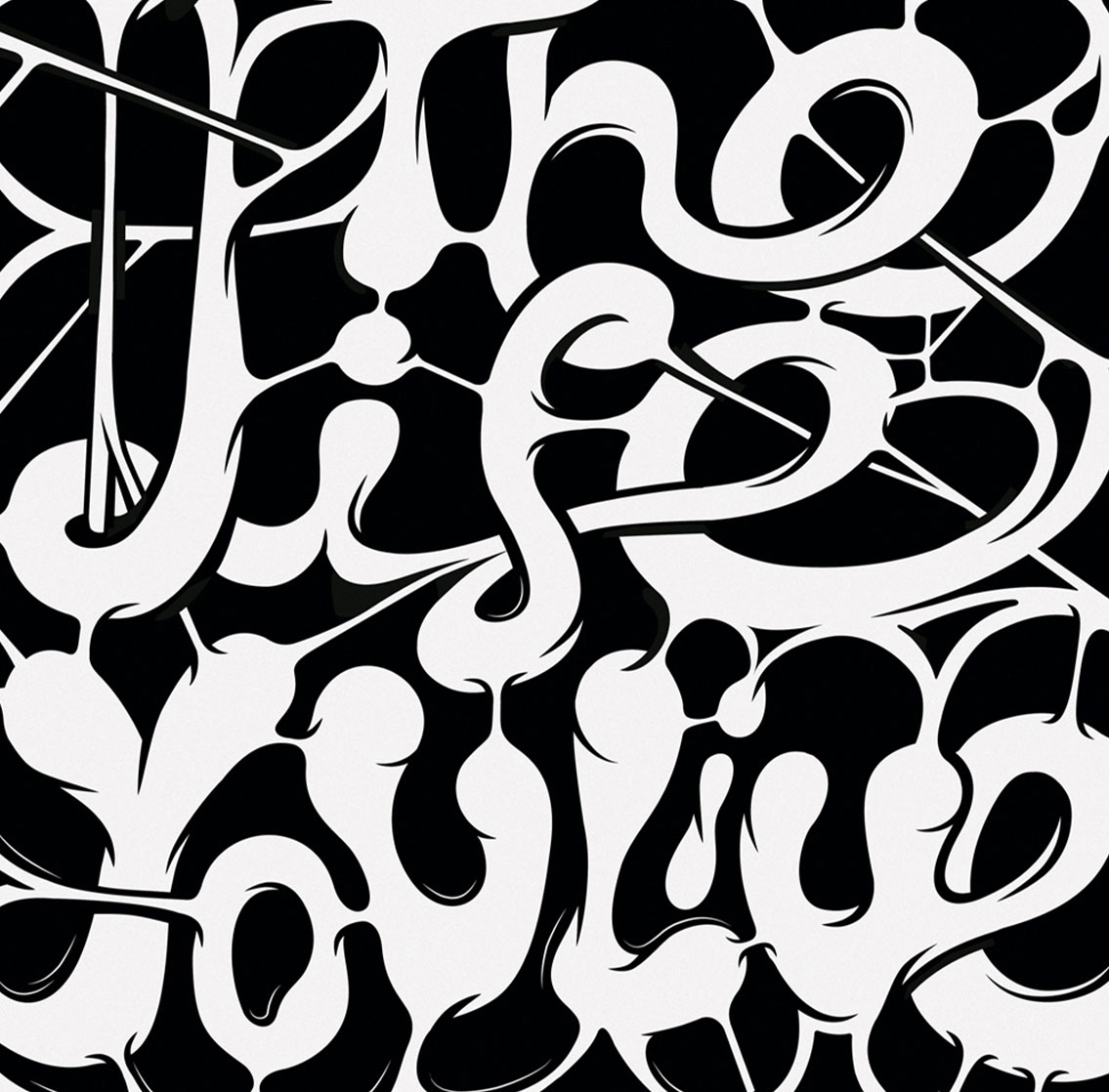
Multiple illustrations used mainly to support branding and advertising. Also some personal projects, record sleeves, posters, visual languages, icons and badges.
The first ever Portuguese surf documentary, released in 2006. ‘Norte-Sul’ (North-South) documents an adventure in Portugal with top national athletes surfing the best waves from north to south.
Impact:
Most sold dvd in FNAC chain stores in Portugal.
My Role:
Art direction, design and illustration.
Over the years I have producing work that helps audiences grasp the things they read and remember who wrote them.
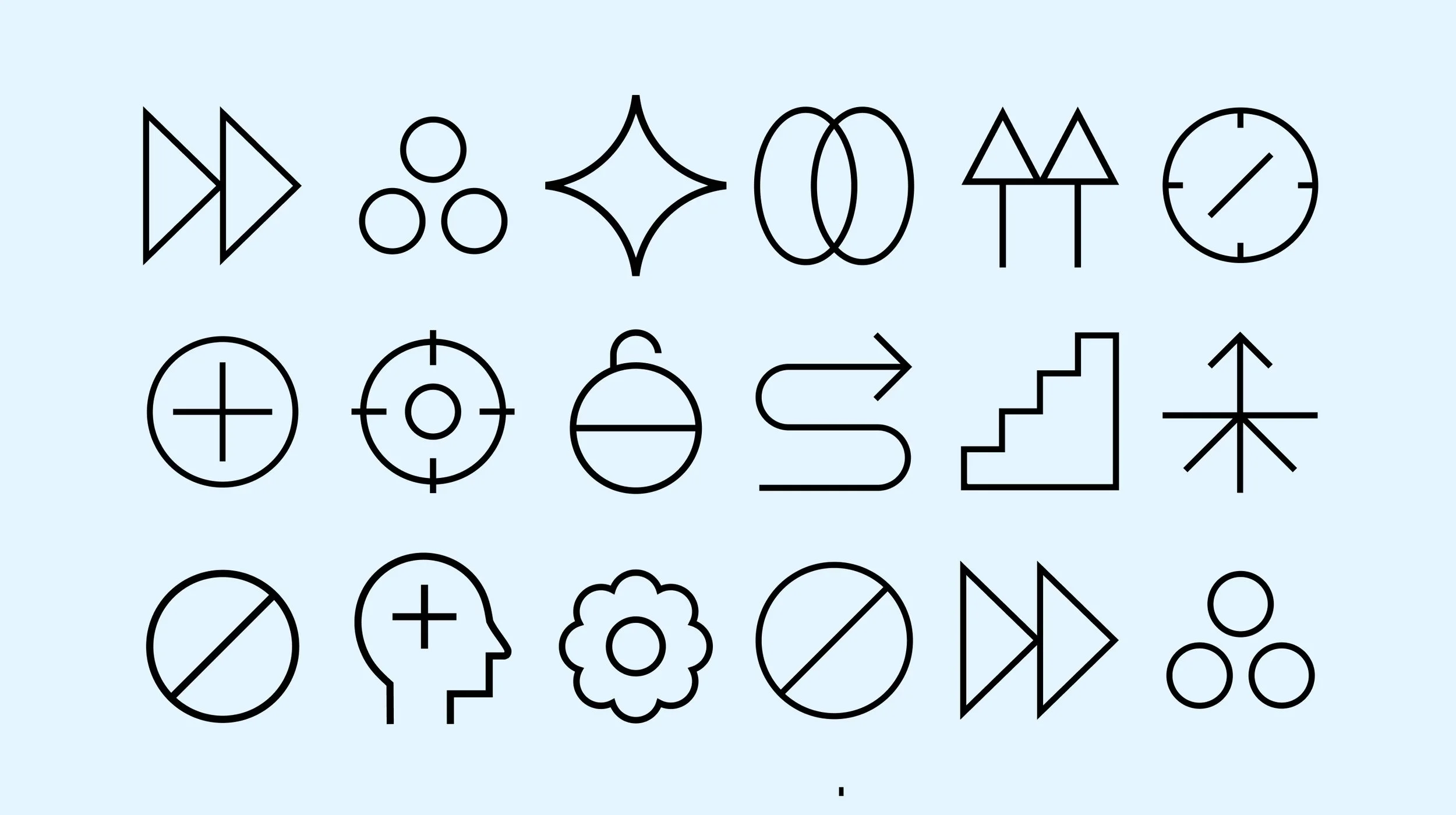
This section contains a selection of logos, symbols, icons and badges for various clients, from the small startups to the established brands from all over the world.